Overview
Reimagining the User Interface
Working directly with app founder, visualising concepts to solve for a new look and feel. Fast turnaround of 2 working days to meet aggressive deadlines for work to be accepted.
Challenge
To uplift the existing design of the app to ensure the visual look and feel matches the story and brand aspirations.
Approach
Took a ground up redesign approach to new visual style. Ensure all elements of proposed designs were on brand and achieving the brief. Push the client to see beyond initial brief taking all designs that extra 10% ensuring client expands thinking and sees and understands all possibilities.
Outcomes
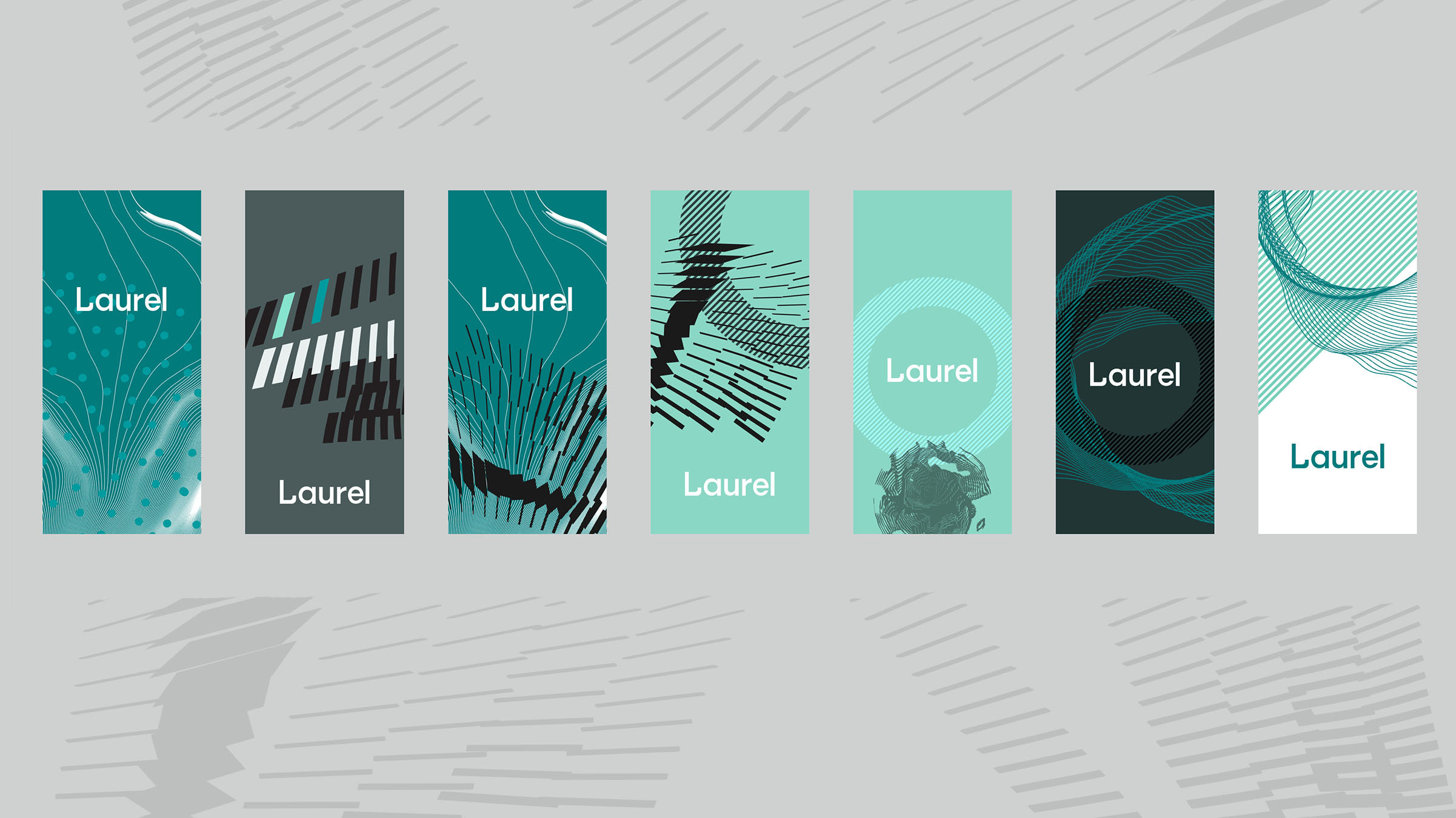
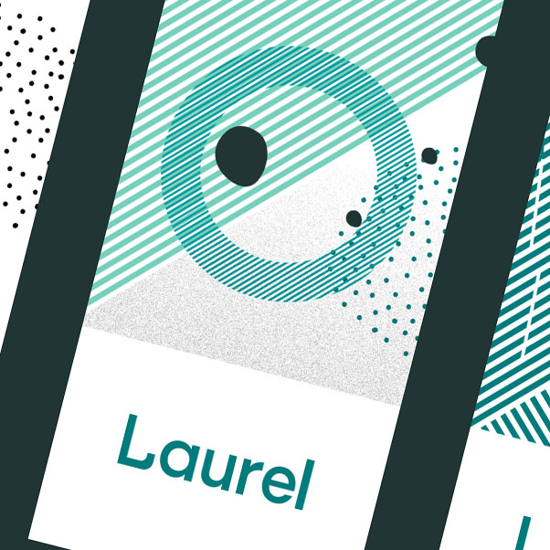
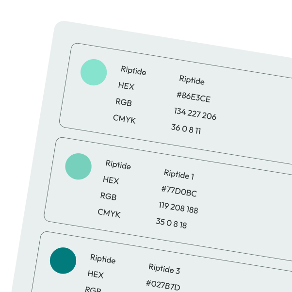
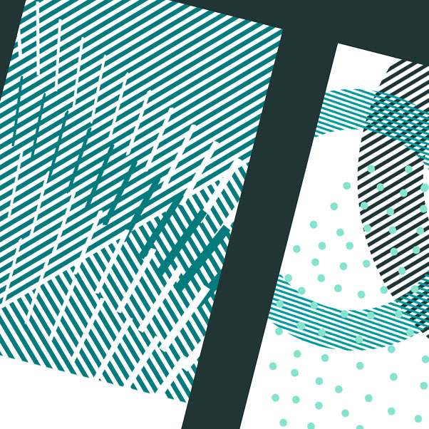
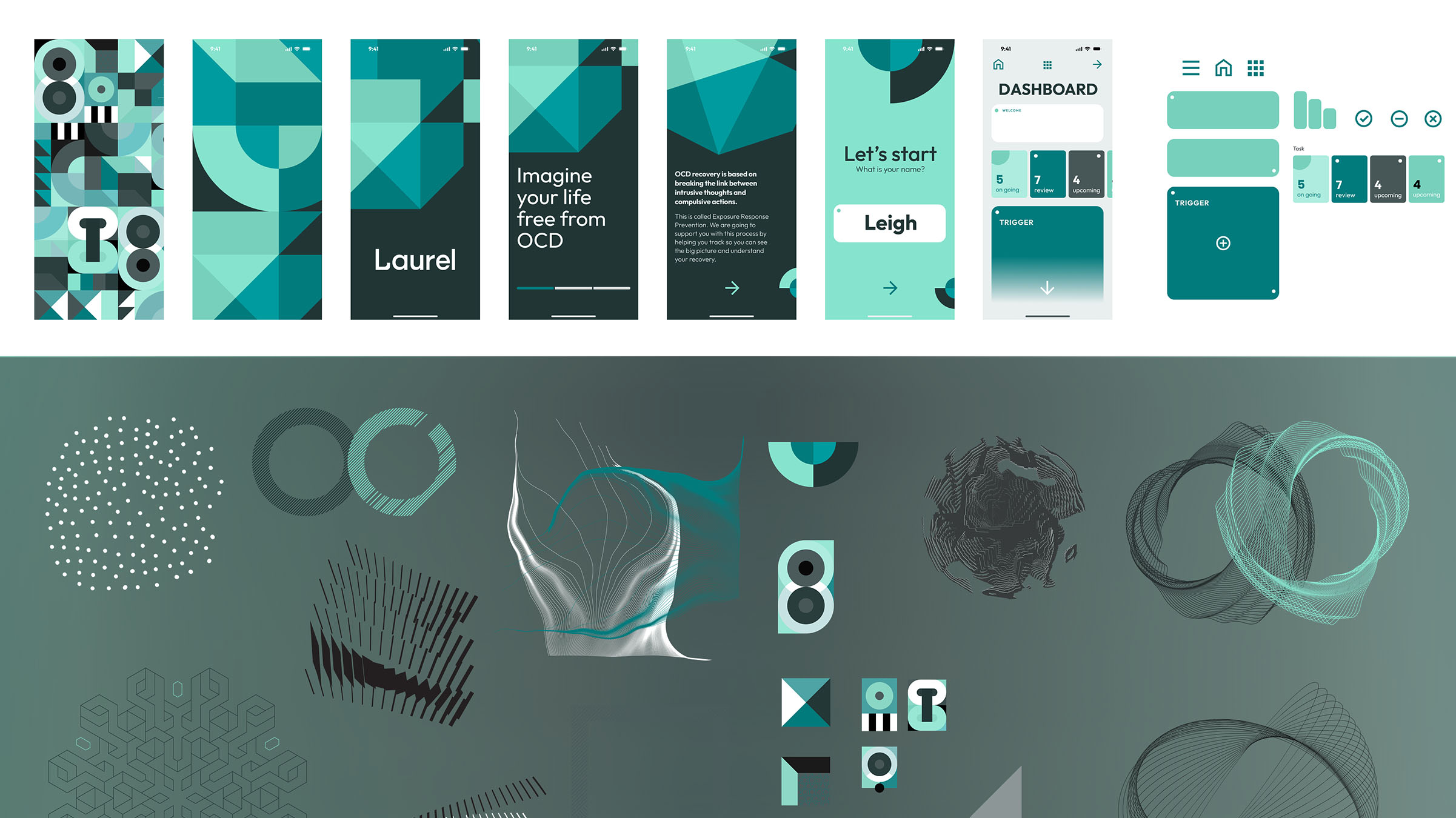
An entirely new visual look and feel. New set of visual standards, keeping only the original logo and single colour way. A visual language of geometric shapes, starting off as a randomised, moving towards a more unified pattern as app is experienced and user starts to take control of OCD.
Met all conditions of brief and commended for fast, dedicated and professional approach to ensuring the work was delivered and understood.
The approach and output on this project led to introductions to other app owners and workstreams within the founders network.
Role
UI / UX Designer
Company
SevenFold Consulting

